NPR App’s Landing Page Redesign
Role
Product Designer
Context
Duration: 2 months
Platform: Responsive Web
Tools
Figma
Problem & Opportunity
As the team came closer to unifying the two mobile apps (NPR One and NPR News) into a singular app, it was the perfect time to update the landing page as well. The old landing page was in dire need of an upgrade due to several issues:
1. Weak Call-to-Action (CTA)
The navigation bar is currently very underutilized, even though it could be another great place have the CTA buttons. Also, the CTA buttons (which prompt users to download the app) are currently in just one section of the page, making users scroll all the way back up after going through the entire content.
2. Lacking Brand Visibility and Recognition
Other than the NPR logo at the top, how would a user recognize and connect that this is an NPR product? The design above the fold is extremely plain and sparse. Better reflection of the NPR brand such as usage of brand colors and visual elements are necessary.
3. Outated Info and Images
The app has had vast improvements and new features over the years, so this page should reflect that. What are some of the best features that we might want users to know about?
4. Accessibility Concerns & Excessive Text
The copy throughout the page doesn’t effectively communicate the core features and aspects of the app, making it difficult for the user to quickly find essential information. Smart copywriting is essential to convince users to download the app.
Overlaying text on top of images is detrimental if done incorrectly. This text does not have enough contrast with its background, making it difficult to read and does not meet visual accessibility standards.
All leading to…
Low traffic
Low conversion
High bounce rates
Design Process
As the sole product designer of this project, the new landing page’s branding elements such as color, typography, and style were within my full discretion. I received regular critique and feedback from other designers (from Product Design and Marketing) throughout the process.
Constraints
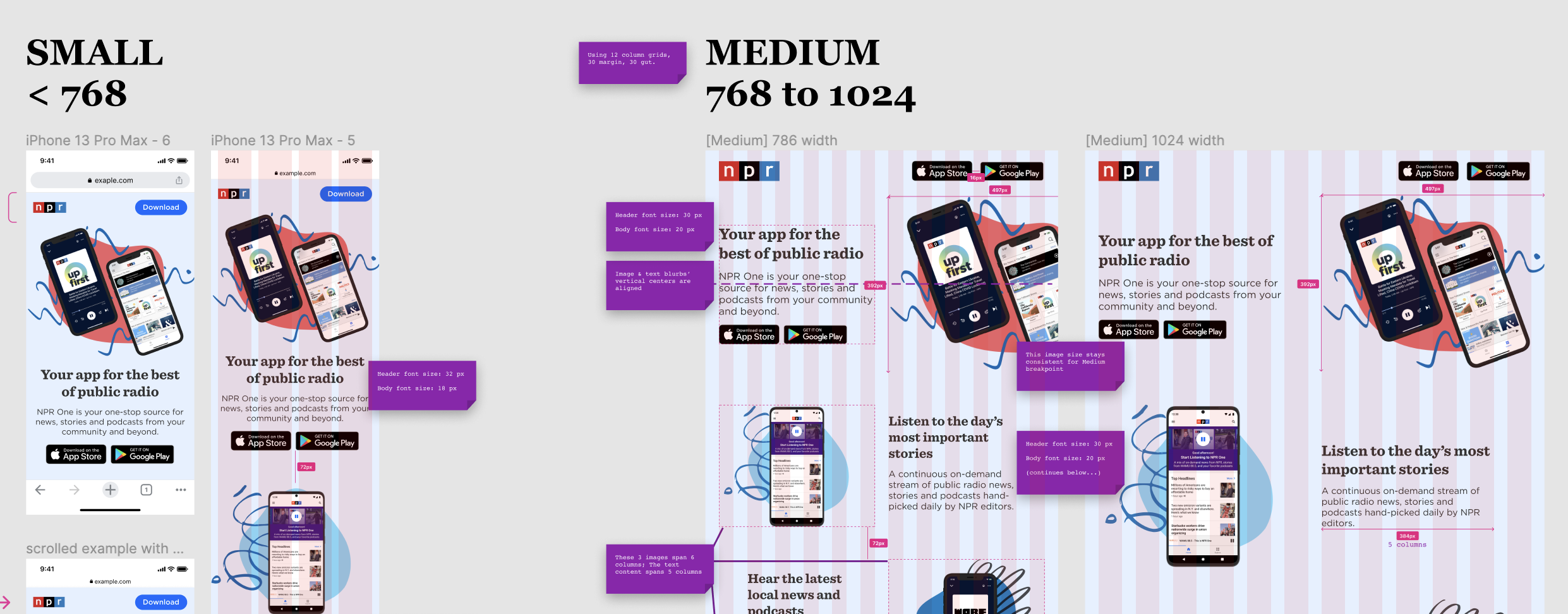
Ideally, I would’ve collaborated with the Marketing team to create the visual assets that display on the new landing page. Due to time & resource constraints, I had to create those assets myself. The assets had to be simple, flexible and versatile because I couldn’t afford to create multiple different variations for different breakpoints (below).
I was also mentoring and collaborating with a summer software engineering intern to build out and implement the new page, with a strict timeline of less than 2 months.
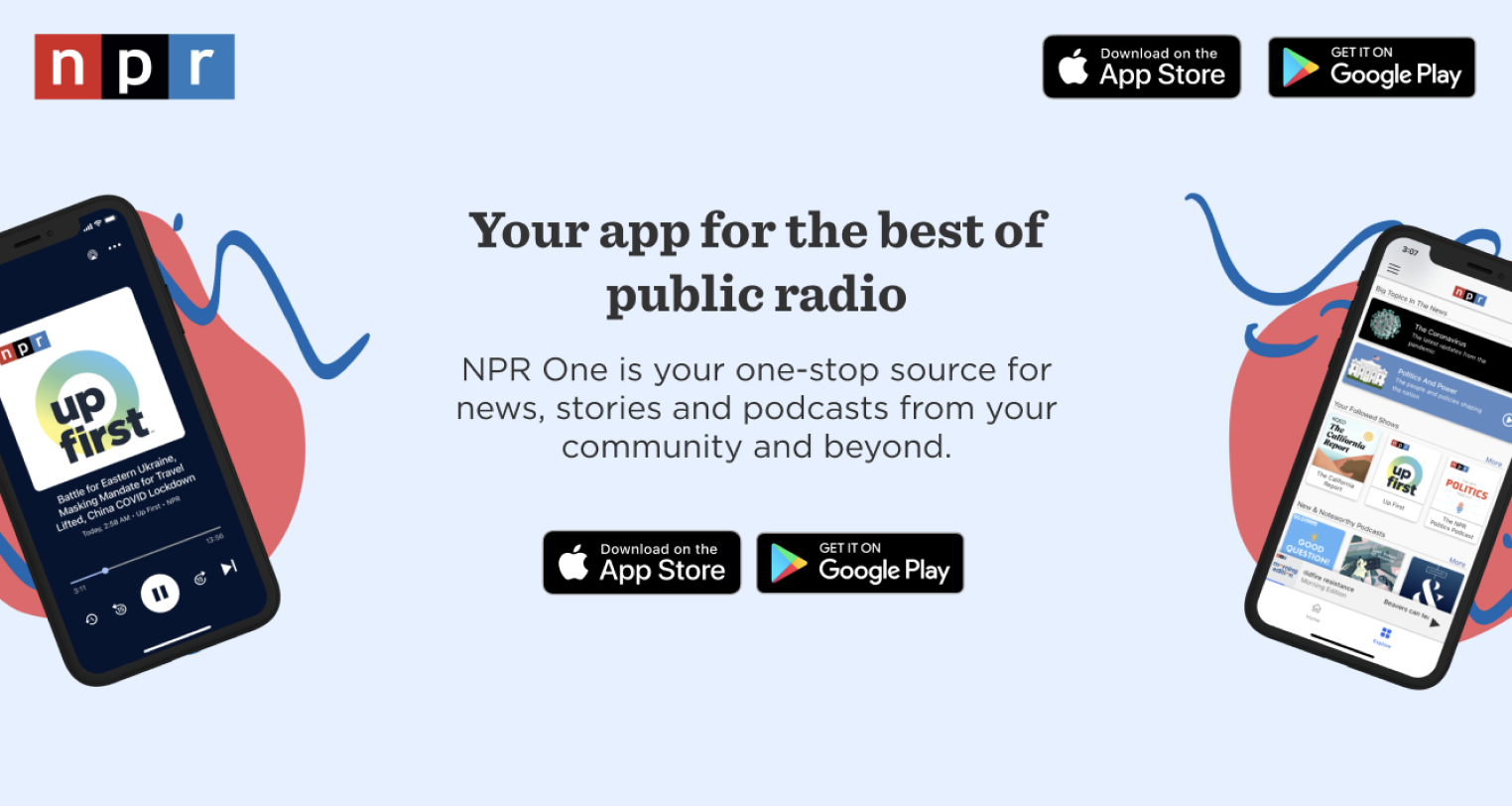
Exploring Shapes, Lines, and Colors
The app’s advantage over the NPR.org website is that it provides a more robust experience for listening in addition to reading. Users can more easily listen to the full breadth of NPR’s rich, illustrative podcast episodes and storytelling on the app. I wanted to similarly convey this with the landing page, so incorporating color thoughtfully became a vital aspect of the design.
I found using blob shapes as a backdrop for the device mockups to be really organic and fluid, which was exactly the vibe I was looking for. I also liked that it framed the devices, rather than having them “float” on the screen. To complement that even further, I explored adding bits of wavy lines which were in part inspired by the shape of audio waves.
Above-the-Fold Section Iterations Combining Those Elements:
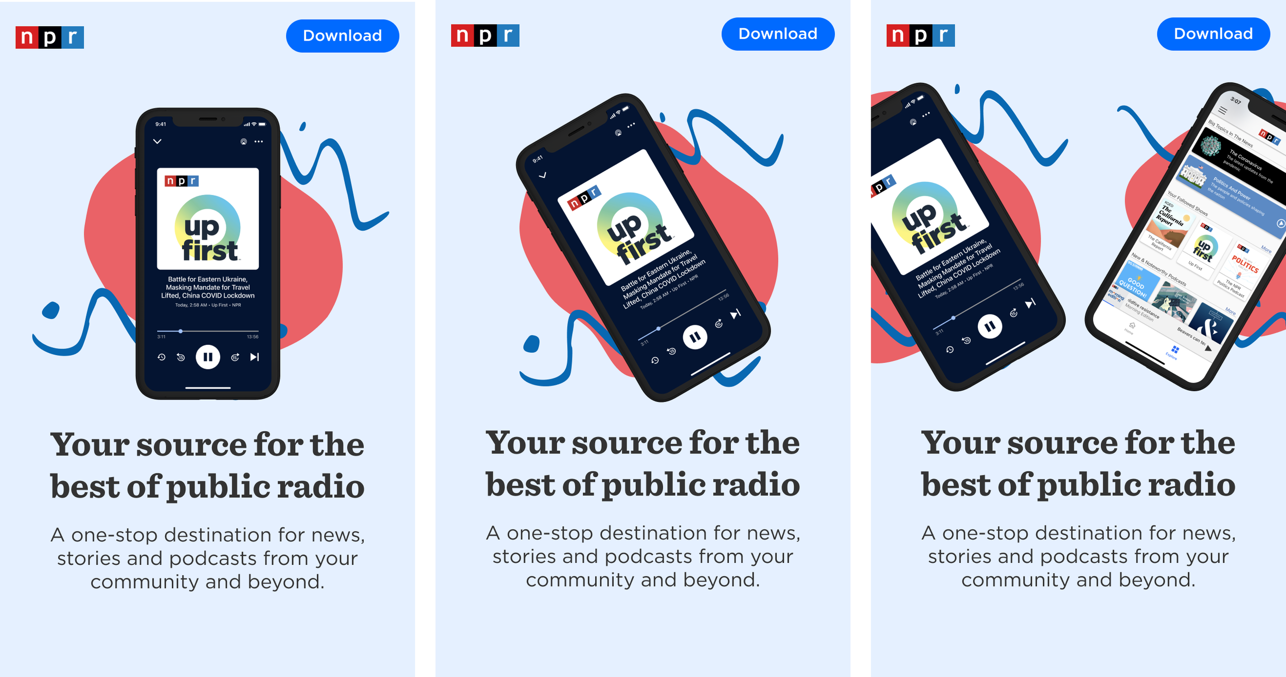
Stress testing these iterations at different breakpoints (small, medium, large widths) helped whittle down which would work best in terms of flexibility and responsiveness.
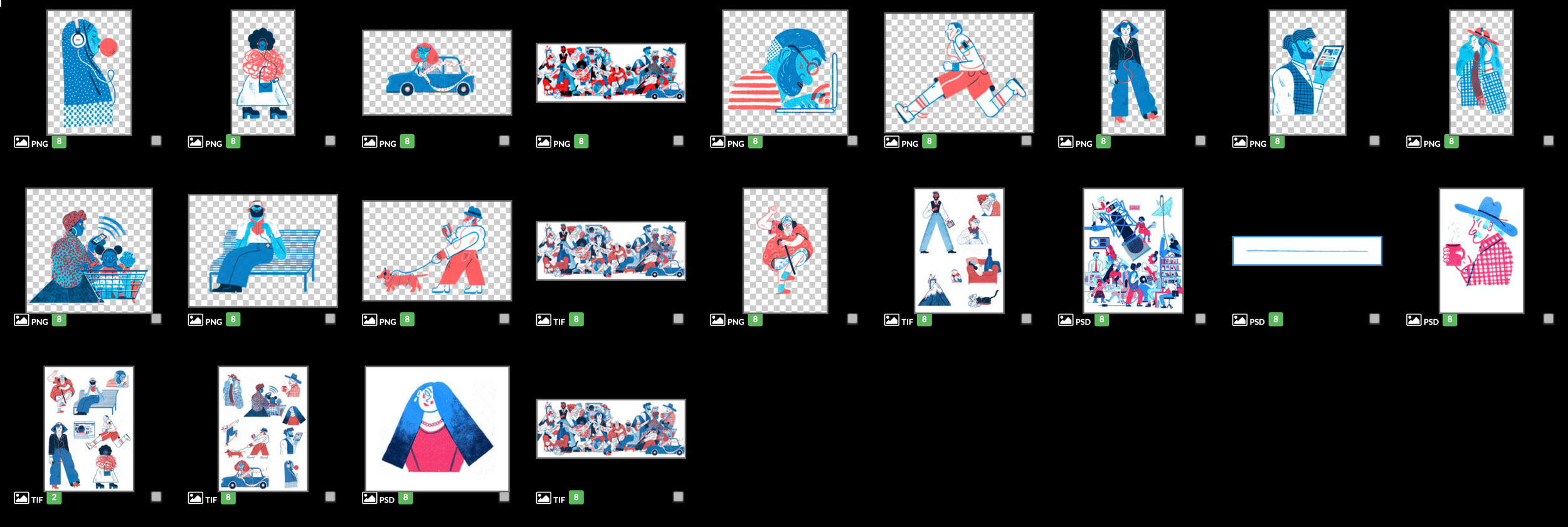
Utilizing Existing NPR Brand Elements
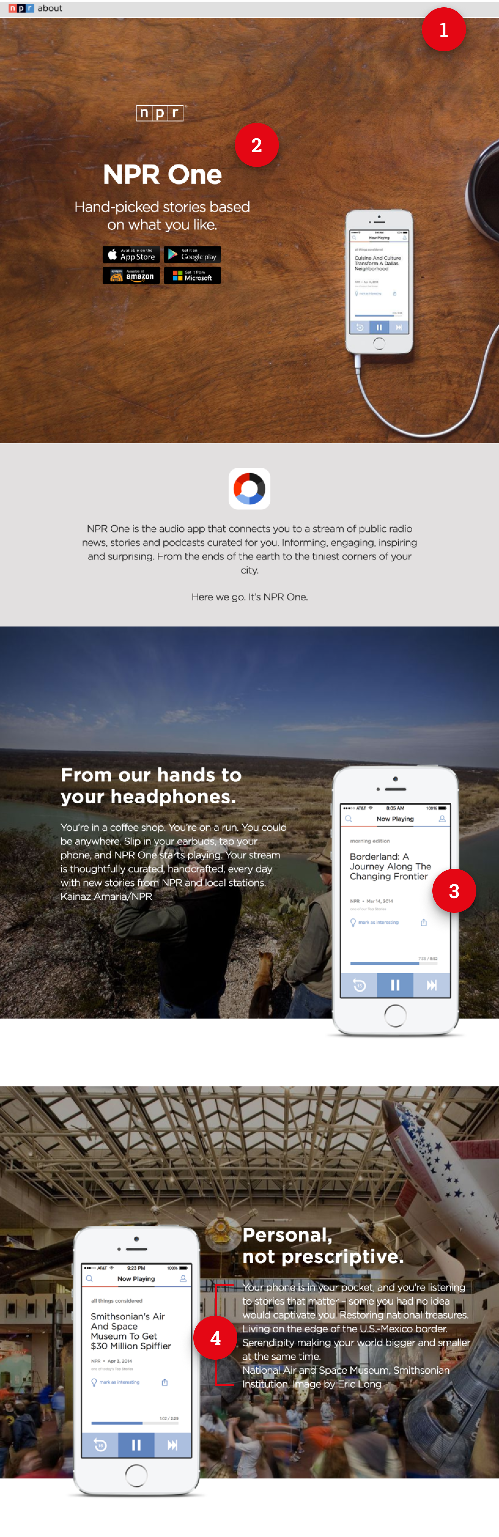
Since I couldn’t ask the Marketing/Brand team for bespoke assets or illustrations just for this page, I looked through ones that were already available. I knew that the illustrations used on the NPR About page would be perfect because they already appear in some areas of the app audio player as well. I also got the color palette inspiration from these illustration assets.
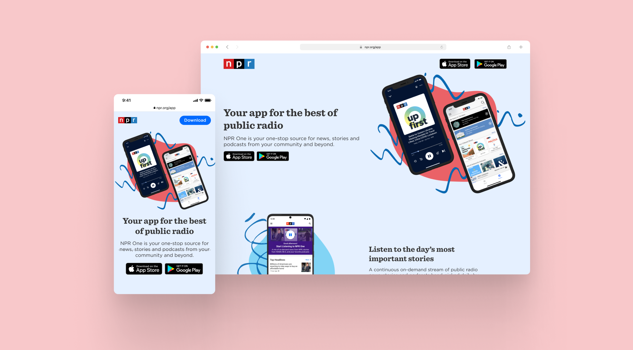
Final designs
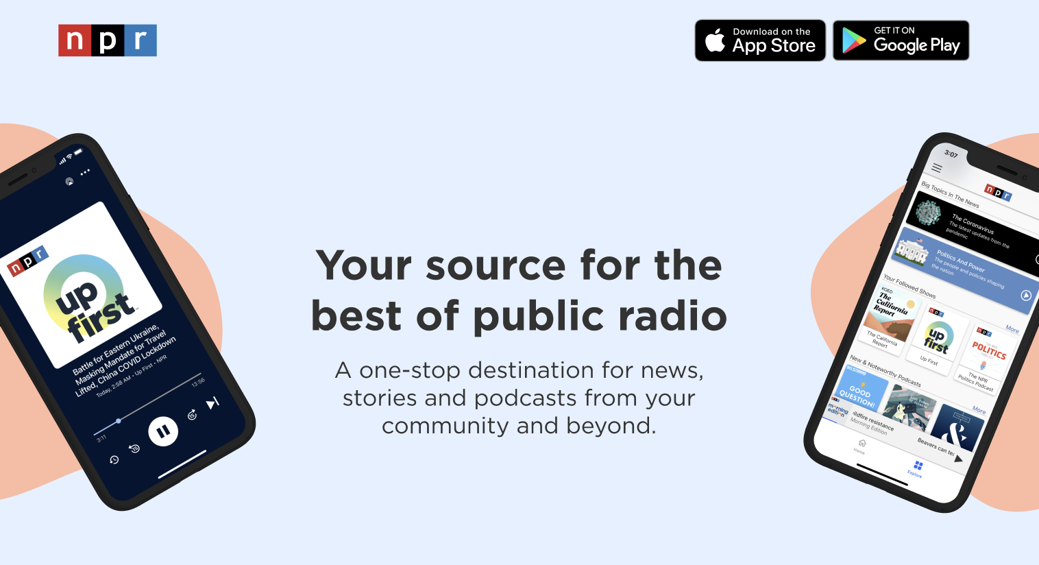
There were several components of the redesign that were significant improvements, both visually and functionally, from the old landing page!
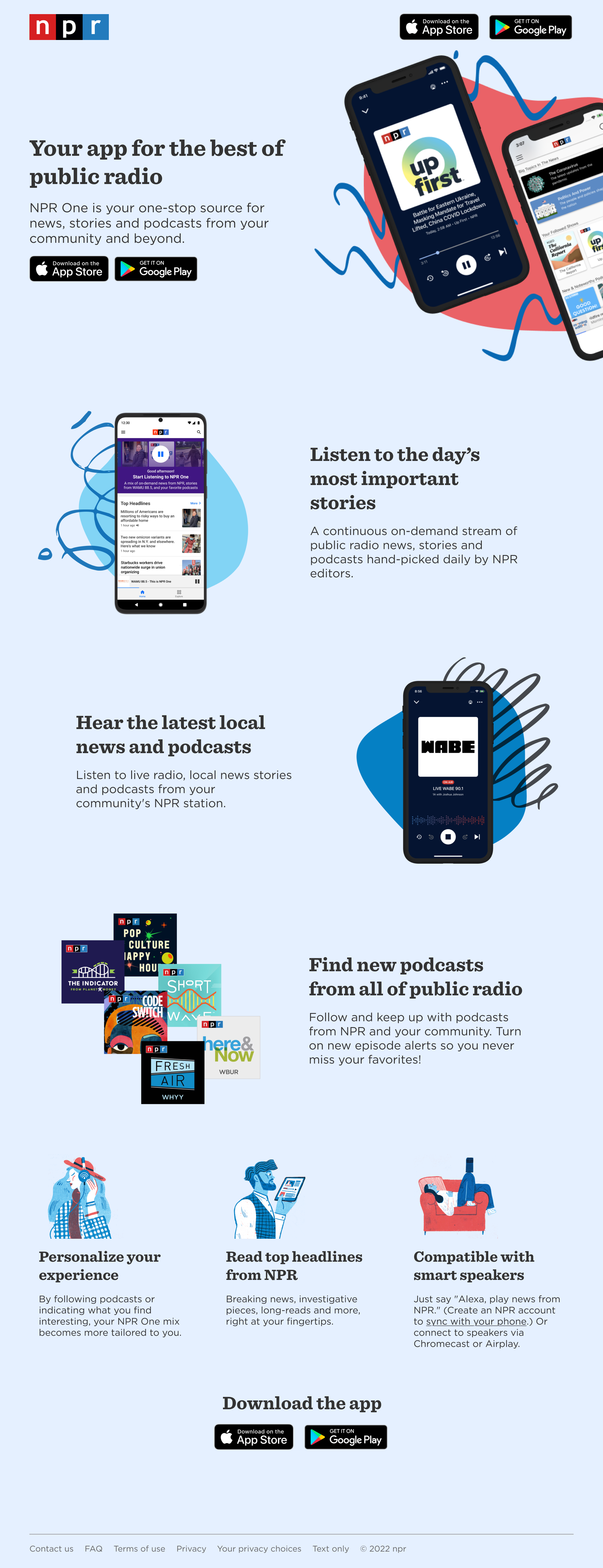
Sticky Navigation and Clearer CTA: By having a stickied navigation bar at the top with links to download the app, the desired call-to-action is much clearer and easy to access. I also added CTAs at the bottom of the screen
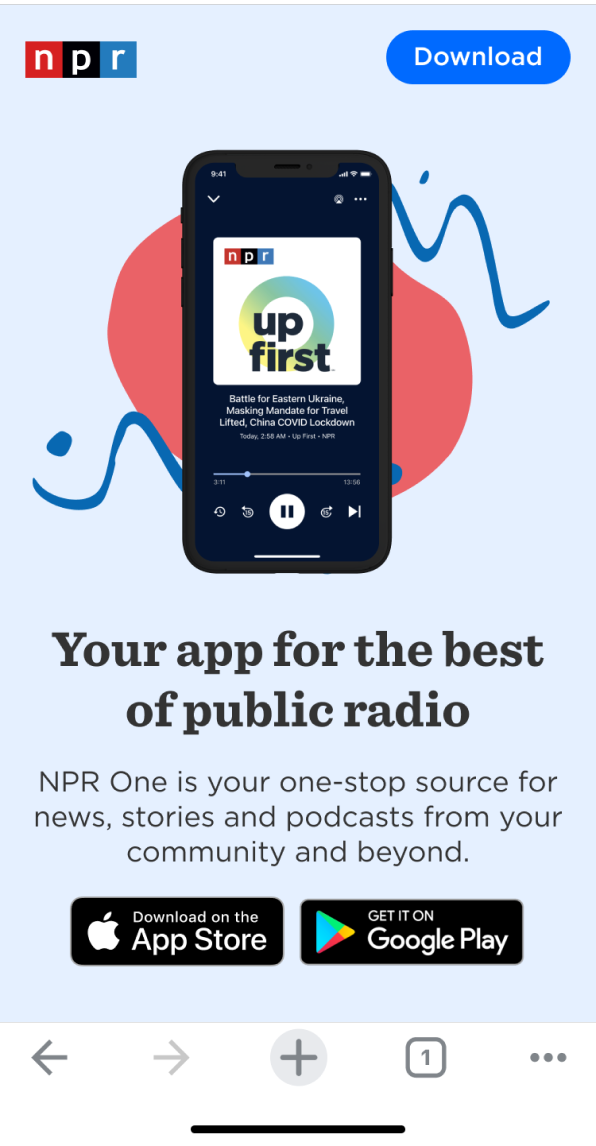
Visually Engaging Hero Image: Previously, the hero image was quite dull and the small device mockup was unbelievably hard to see. Utilizing the new fluid and colorful visual assets, there’s more movement and reflects the captivating news and stories you’ll hear on the app.
Meets Accessibility Standards: To meet WCAG accessibility standards for text contrast, placing text over an image need not be completely avoided, but special care must be taken to ensure that the text is both legible and readable to users.
Concise, Relevant Copy: Each headline starts with a verb (Listen, Hear, Find) so that users know exactly what kind of simple actions they can do on the app. This not only helps users quickly skim to learn about the features, but also improves the page’s SEO since it uses more relevant keywords and phrases.
Building it out with Engineering team
To prepare the designs for engineers, I had to clearly lay out the different rules at different breakpoints–mobile, tablet, and desktop sizes. Since a new SWE intern would be building out most of it, I made my notes more thorough than usual! I found using responsive grid layouts to work best for our needs.
Result & Impact
Comparing the most recent 30-day period to the period before the launch, the results displayed significant and dramatic changes.
163% increase in page views
28% decrease in bounce rate
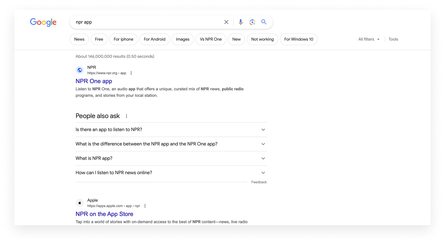
Improved SEO, with the landing page result being the very first result if someone googles ‘NPR app’ this is likely the result of using better keywords and phrases in the page.
Overall, this meant that more people were viewing the page, leading to more people clicking on the ‘Download app’ CTA button!
Lessons Learned
Being comfortable with imperfections. If given more time, I would’ve loved to 1) incorporate animations and transitions to make the page feel more lively 2) create different assets for different breakpoints. Due to time constraints, I had to be comfortable with the amount of work I was able to deliver (and I was!)
How to be creative with Figma plugins. I found a couple handy plugins (Blush and Make Blob) that really accelerated my work when I was brainstorming the visual elements. These plugins gave me a great head start, but I continued to fine tune the assets to exactly fit my needs.