NPR One: Redesigning the Audio Player
Role
Product Designer
Researcher
Context
Duration: 8 months
Platform: Mobile (iOS & Android)
Tools
Figma
User Interviews
Overview & Problem
NPR had two mobile apps: NPR News and NPR One. The apps were slated to be consolidated and rebranded as simply the NPR app, encompassing the wide range of content offered by both apps. This meant that the audio player, one of the main interfaces of NPR One, needed a huge revamp.
NPR One’s major focal point was simple: you hit the play button and you’d hear the latest news & podcasts, curated by NPR editors. The player screen, which displays information about the currently playing item and audio controls, was too simple and inconvenient to access. The player lived in a ‘Listen’ tab as part of the navigation, so you couldn’t see or access the player if you were viewing any other page. Having a small, persistent and accessible player was key for NPR One to support easy browsing, reading, and listening experiences.
In addition to lack of persistent audio controls, the Listen tab felt incredibly barren despite lots of content to display. It was clear that I needed to rethink how users could interact with the player in a more visual, engaging way:
The last key part to consider ended up being the hardest challenge:
There are SO many different types of audio!
NPR One can play:
Short 3-5 minute hourly newscasts
Segments from the daily radio programs (Morning Edition & All Things Considered) or stories from local member stations
Podcast episodes (some can be almost an hour long)
Live streams from any local NPR station or special live coverage from NPR
Sponsor messages
I had to become an expert on the content we provide so that the new player can not only support, but also enhance the listening experience of each one.

Screenshots of the old player, which lived in a Listen tab, playing different content
Competitor Analysis Research – How Can We Be Better?

Having a mini persistent player at the bottom of the screen makes it convenient to play/pause audio or open up the player for more details and controls. This is an industry norm and our team knew this was the approach we would also have.
When the audio player is in full screen mode (see below), you typically see more playback controls and an enlarged podcast logo. A big downside I noticed is that many apps typically just display one line of text for the title–the title scrolls horizontally like a marquee, so for a particularly long title, you have to wait a few seconds to read the entire title. I believed this was an aspect our player could improve on: our audience should be able to read the entire episode title at a glance.

Screenshots of audio player from Apple Podcasts, Spotify, iHeartRadio, Google Podcasts
Plan
The player redesign was split into 2 phases to make it easier for iOS & Android developers and QA engineers to minimize any regressions.
V1:
Move the ‘Listen’ tab player into a persistent overlay player that could be expanded & minimized
V2:
Redesign the entire player from its visual design & functionality improvements. Add in the most frequently requested features from users, while also ensuring the design has room for growth for future iterations.
V1 Player Result
The team focused a lot of attention on the new minimizing & expanding interaction of the player. We were able to achieve the mini player being both tappable and swipeable to open it up. During user testing most participants understood how to use all the player controls, whether it was in the minimized or enlarged player, and noted that it was a familiar pattern to them.

V2 Player: Rapid Brainstorming with Digital Wireframes
We did an exercise of Crazy 8’s to organize the numerous player features/metadata that we currently have and want to have. Another designer and I used a simple wireframe template to quickly come up with various virtual sketches.

Priorities & Constraints
After the brainstorming session, we were overwhelmed with the possibilities! Thinking back to our different groups’ needs and constraints helped us converge on more detailed wireframes.
For instance, a lot of NPR’s episode and segment titles are lengthy, so we knew we didn’t want to limit that field to just 1 line. We decided to prioritize the title and allow it to span 3 lines, ensuring that the entire title is easily and quickly scannable. However, some users wants lots of options for control and customization, such as changing audio speed or setting dark mode. In order to avoid clutter, features meant for “power users” were put behind a secondary menu (see below). I decided the new player should be full screen so that it can have more flexibility for buttons & metadata. I created wireframes with “ideal” state of the player in mind for user testing. (What could the player look like in 2-3 years?)
Testing the Wireframes

I planned and conducted user research to test out this Figma prototype of the V2 Player wireframes. The sessions were all conducted over Zoom and the participants interacted with the prototype from their smartphone so that it’s a closer representation of a mobile app.
Research Goals:
Learn if the new player interface is easy to use and understand for current & potential NPR One users
Learn if the new features (such as audio speed and see the queue) can be found and used correctly
Validate the direction of high fidelity designs
Some Research Findings:
Even though the secondary menu (which appears after tapping the ellipsis icon) provides a lot more options than we currently do, no one found it overwhelming or confusing
Participants correctly identified several of the player’s affordances, such as dragging the screen or tapping the down arrow button to minimize
We met our research goals with some clear next steps in mind.

V2 Player Result
The V2 player had several exciting improvements from V1! Here are the highlights and why they were implemented.
1) Improve Visual Hierarchy & Boost Branding
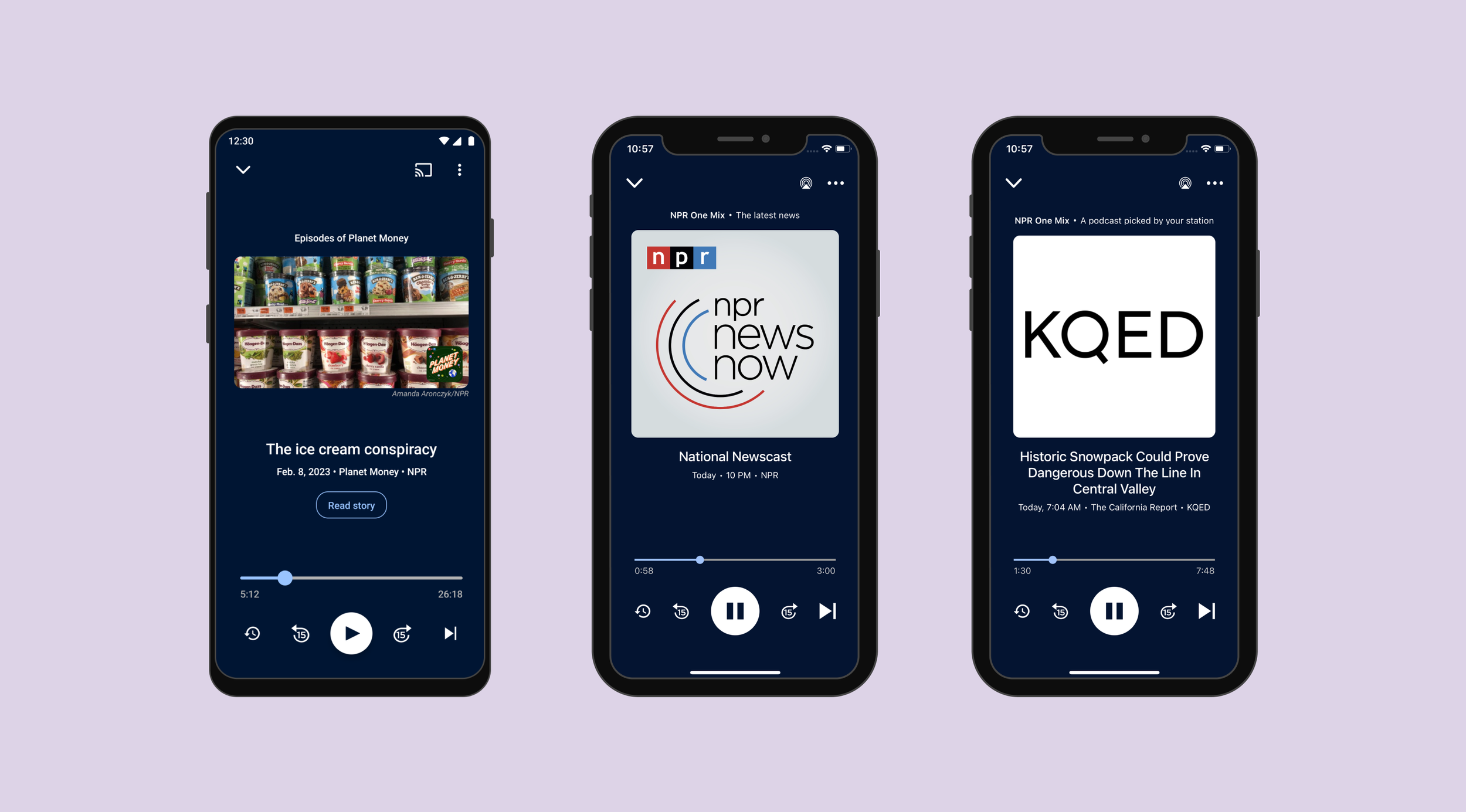
The player’s most important details, which are the text and audio controls, are together at the bottom half of the screen making it easy for thumbs to reach. By slightly decreasing the title font size, we could fit in more characters and improve scannability. The podcast logo occupies the remaining space, and is significantly larger than V1. This significantly amplifies the branding and recognition of the podcasts since the podcast name is typically prominently displayed in the logo. When a listener stumbles on an unfamiliar podcast, this greatly aids in recognition and familiarity, facilitating their engagement with the content.

2) Darker Palette
Dark mode is a feature that is highly requested by our users, which is what influenced the decision to make the new player’s interface much darker than the rest of the app. Although the app doesn’t have a formal dark mode (yet), the player with this new darker palette will serve as a good starting point for when we do.
3) Additional Audio Controls
We added a button that fast forwards 15 seconds, another frequently requested feature from our listeners. Unfortunately due to technical constraints, we were unable to add a ‘back’ button that goes to the previous item(s) you were listening to. After another round of user testing and iterations, we decided on an alternate solution: a ‘Recently Heard’ button. While having a functional' ‘back’ button is ideal (and we hope to add it in the future), this was a great workaround that appeased a lot of stakeholders and users.

4) Provide Listening Context
As I expressed earlier, one of the challenges of this project was handling how to effectively convey all the different types of audio available on the app. I proposed a new API field at the top called the Listening Context that displays exactly what “type” of content you’re listening to.
A personalized, continuous stream called NPR One Mix autoplays the latest news and episodes of your favorite podcasts. We knew that our audience doesn’t always understand this algorithm or why they’re getting the stories they get. Having this Listening Context text at the top conveying what they’re hearing at a glance is helpful, especially to new users. The Listening Context appears for other on-demand content as well, such as when you listen to your Playlist or only listening to episodes of a particular podcast.

5) Expose Episode Images
Some podcasts publish episodes with photos or artwork to accompany episodes and these are the primary images shown on the website. Since producers and editors spend time to find the right image or hire illustrators to create bespoke art, I wanted to make these photos visible on the player. These images add a new visual element that’ll change day-to-day for active podcast listeners. It also gives a vibrant snapshot of what the episode will be about. This is personally my favorite aspect of the new player!

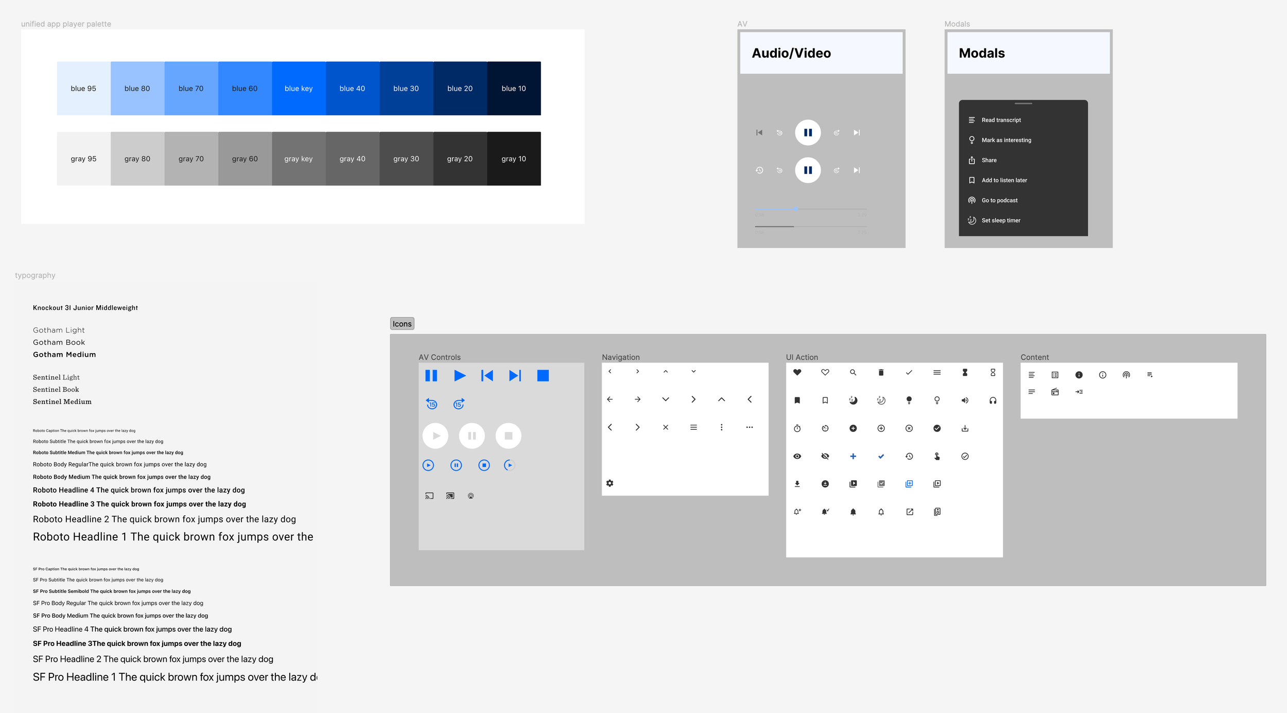
Documentation & Design System
As the designer responsible for creating and maintaining the mobile team’s design system, I had to organize and document a lot of new components and tokens, such as color definitions, typography, and icons. During this project, the team decided the apps should use system fonts since the licensed fonts were not flexible. While designing the V2 Player, I had to create a new type system for both iOS (SF Pro) and Android (Roboto) and this served to be monumental for future projects going forward.
What I Learned & Next Steps
How to break up a large daunting project into smaller, iterative steps
Balancing numerous metadata to create a balanced interface
Working with iOS and Android developer simultaneously
Best practices for an audio player
There is a lot of room and flexibility for new features. In the future there could be more improvements to the player, such as better sleep timer and audio speed configurations. Perhaps a way to read the transcript as you listen along. Whatever it is, user research must be involved to learn what our audience wants and to help guide our next steps!